Real Estate Agent Brand Kit: Fonts, Colors, and Post Styles That Signal “Pro”
Real Estate Agent Brand Kit
Fonts, Colors, and Post Styles That Signal Pro
A practical visual-system blueprint for agents who want every ad, email, flyer, social post, video cover, and website graphic to feel consistent, credible, and easy to produce.

What belongs in a real estate agent brand kit?
A real estate agent brand kit should include one color system, one font pair, logo rules, three reusable post styles, a one-page brand sheet, and channel templates for ads, email, print, video covers, and website graphics. The goal is not decoration. The goal is repeatable visual control that makes every client touchpoint feel connected, professional, and easy to produce.
- A brand kit is an operating asset, not a mood board. It should reduce design decisions and make every campaign easier to ship.
- The strongest kit starts with one primary color, one deep neutral, one light neutral, one accent, and one documented font pair.
- Three reusable post styles are enough to support market updates, authority content, and local or listing stories without visual drift.
- Template reuse rate, build time, branded click-through rate, and post consistency weeks are the practical KPIs to monitor.
- The final brand sheet should be simple enough for a virtual assistant, designer, ad vendor, or internal helper to use without interpretation.
What You Build With Your Real Estate Agent Brand Kit
The real estate agent brand kit in this playbook keeps things intentionally tight. You will lock one primary color system with a supporting neutral and one accent, one font pair, three repeatable post styles, a single page brand sheet, and three channel templates that you can reuse across ads, email, and print.
The payoff is speed and trust. Once this brand kit is live, you stop redesigning every flyer and post, hand clear rules to any helper or vendor, and give your market the same polished impression every time they see your name. The same system should extend into listing flyers, postcards, video covers, email headers, and your IDX Real Estate Websites.
Most agents do not have a branding problem because they lack taste. They have a system problem because every new asset starts from zero. A real kit removes that friction and turns design into a controlled workflow.
- Overloaded palette: too many colors change every week, so nothing looks related.
- Font drift: random type choices make every touchpoint feel like a different company.
- Layout roulette: every flyer, carousel, and email header uses a new structure, so the market never learns your visual rhythm.
- Low contrast: soft text on soft backgrounds fails basic accessibility and weakens professional credibility.
- Asset chaos: logos, icons, headshots, listing photos, and campaign files live in random folders across devices and drives.
Consistency compounds when the market can recognize your work before it reads your name. A disciplined brand kit gives clients that recognition cue across every channel.
Brand Kit Foundations That Keep You Consistent
For this article, a real estate agent brand kit means one documented color system, one font pair, three social post styles, a single brand sheet, and a central asset folder that holds everything. The color system covers a primary brand color, one deep neutral, one light neutral, and one accent, plus guidance for buttons and text on light and dark backgrounds.
It also defines a type stack that pairs one workhorse sans serif with one confident serif so headlines, body copy, and captions never drift. That foundation supports habits, because consistent outreach becomes easier when visuals are already handled. Five Client-Winning Habits pairs well with this process because it shows how to feed better visuals into daily execution.
Choose fewer colors and enforce them
Pick one primary color, one deep neutral, one light neutral, and one accent. Save the hex codes in your brand sheet and require a contrast check before those colors appear on buttons, small text, or disclosures.
Define hierarchy before style
Use one headline font and one body font. Give each one a job: headline, subhead, caption, button, body copy, disclaimer, and quote. The fewer exceptions you allow, the more professional the system feels.
Make the kit easy to find
Build one master folder with subfolders for logos, icons, photos, social graphics, print files, email headers, and ad creative. Every final asset should have a clean name and a predictable home.
Document the rules once
Keep the rules visible: colors, fonts, logo placement, button treatment, photo style, post styles, and file naming. The sheet should be clear enough that a new helper can produce a compliant asset on day one.
Consistency multiplies throughput. When your real estate agent brand kit removes design decisions, you can track two simple controls: how often you reuse a template and how many minutes it takes to ship one asset.
Step By Step Real Estate Agent Brand Kit Framework
Treat this real estate agent brand kit as a five hour project that you can break across two sessions. The agent owns direction and approvals, a virtual assistant handles file naming and folder structure, and a vendor can help with one-time design tasks such as logo cleanup or button styling.
Every move in this framework has an owner, a clear deliverable, an acceptance rule, and a simple operating metric. You are not chasing perfection. You are aiming for a kit that deploys fast, lives in one folder, and keeps design choices steady for at least ninety days.
- Choose your primary palette. Pick Coastal, Warm Modern, or Evergreen, then adjust one color if needed. Save hex codes in a brand sheet and require a WCAG AA contrast check for buttons and small text before approval.
- Select one font pair. Use Inter Tight with Source Serif Pro, Poppins with Roboto, or Montserrat with Lora. Test headlines, subheads, and body text in one sample flyer.
- Build the asset folder. Create subfolders for logos, icons, photos, social templates, and print files. Move all final assets into that structure so nothing hides in downloads or text threads.
- Create three social post styles. Design one market facts post, one authority tip post, and one client story post using the chosen fonts and color system. Measure build time and aim for a ten minute repeat build once templates are approved.
- Approve layout rules. Decide which color owns buttons, which font owns headlines, and how logos sit on light and dark backgrounds. Every mock should follow those rules without exceptions.
- Build three channel templates. Create one ad template, one email header set, and one print flyer frame that all use the same header zone, logo placement, and button style. Tie the system to Email Marketing for Real Estate Agents, postcards, and lead magnets.
- Document the kit on one page. Capture colors, fonts, logo rules, post styles, and example screenshots in a single brand sheet. Store that file at the top of the brand folder.
- Run a test week. Publish one post in each style, send one email with the new header, and export one flyer. Track minutes spent per asset and confirm that each piece looks like the same brand at a glance.
- Set naming and version rules. Use clear names such as brand-kit-color-palette, brand-kit-font-stack, and brand-post-style-market-stats. Nobody should save a file with a camera default name or a vague draft label.
- Set a ninety day lock. Commit to using the brand kit as written for ninety days. No new fonts, no extra colors, and no random layouts unless a contrast issue or channel requirement creates a practical exception.
Three Reusable Brand Post Styles
The fastest way to operationalize the brand kit is to give your social, email, and print work three repeatable content frames. Each style should use the same color tokens, font hierarchy, caption treatment, and call-to-action rhythm.
The market facts short video and tile
Agent dialogue
Hook lineHere is what changed in our local prices this week.
Middle lineThis quick snapshot shows the price movement, days on market, and buyer behavior worth watching.
CTA lineSave this post so you can track your neighborhood with real numbers.
Open on your face, cut to a simple chart tile using your primary color, and close with a callout tile that repeats the same layout every week.
The problem to solution brand story post
Agent dialogue
Hook lineMost sellers do not realize how much sloppy visuals can hurt trust.
Middle lineWe now use one brand kit for every mailer, email, listing update, and market campaign.
CTA lineIf you like clear, steady communication, this is how we market homes.
Use this style when you want to connect visual consistency with seller confidence, listing discipline, and your repeatable marketing process.
The hidden feature or local gem carousel
Carousel structure
Hook lineThere is a small detail in this house or neighborhood that buyers love to discover.
Middle lineEach slide uses the same color bar, caption style, and typography so the feature stays clear.
CTA lineFollow for more local details that never show up in generic marketing.
Tie this brand story to your nurture system. Real Estate Drip Campaigns That Actually Convert lands better when every touch uses the same visual language.
Creative And Messaging Rules For A Serious Brand Look
Keep headlines under six words and make them strong and plain. Use your sans serif for headlines and your serif for body copy to keep contrast clear without extra flair. Every caption should read like spoken language, not brochure copy.
Run a simple CTA ladder. Use soft prompts on awareness posts such as Save this for later or Share with a neighbor. Use mid strength prompts on nurture assets such as Reply with your street for a custom update. Use harder prompts on listing or valuation campaigns that point into Direct Mail for Real Estate Agents and Retargeting.
Make one rule that every asset must respect: primary color on buttons, captions in the body font, and layouts that repeat the same structure at least twelve weeks in a row. That stability is how a real estate agent brand kit starts to feel like a real brand in your market.
Do not chase novelty. A market remembers what repeats. The brand kit should make your campaigns cleaner, faster, and more recognizable without making every post feel like a design exercise.
Brand Kit Budget And Time Model
You can stand up a solid real estate agent brand kit without burning a huge budget. The point is to assign spend and hours up front so you know who builds what and how long each piece should take. Use these ranges as practical tiers to shape your own plan.
Plan one hundred fifty to three hundred dollars per month. That covers one design tool subscription, a small template pack, and two hours of virtual assistant time for file management.
Plan six hundred to one thousand dollars per month. That funds a part-time designer or strong virtual assistant, plus a small test budget for branded social ads that reuse the same templates.
Goal: steady recognition among local homeowners. Audience: owners in your core farm who see you in feed and in the mail. Headline: Your Weekly Market Facts. CTA: Get the numbers for your street.
Goal: valuation leads from owners who feel boxed in by their current space. Audience: move-up sellers in your core neighborhoods. Headline: Curious what your home could sell for now. CTA: Request your no-pressure price range update.
Deployment gets real when the kit shows up everywhere. Plug your new visuals into Social Media Management for Real Estate Agents, consistent print farming, and a simple nurture sequence built with Monthly Email Newsletter Ideas for Real Estate Agents. The more reuse you see, the better this model is working.
Brand Kit KPIs You Can Actually Track
Treat brand performance as instrumentation, not promises. For awareness ads that use your real estate agent brand kit, expect click-through rates in a range between seven tenths of one percent and one and a half percent once creative has settled. For email built from your branded templates, aim for build times under thirty minutes for a standard send.
Track template reuse rate by counting how many of your monthly posts and print pieces come from your three core styles. A healthy range is sixty to eighty percent reuse. Post consistency weeks are even simpler. Count how many weeks in a row your visuals match on social, mail, and email without surprise fonts or colors.
| Tier | Monthly spend | Agent hours | VA or vendor hours | Deliverables included | Ninety day target outcome |
|---|---|---|---|---|---|
| Starter kit | $150 to $300 | Two to three hours | Two to four hours | One color system, one font pair, three post templates, basic email header, simple flyer | Consistent visuals on social and print for one core farm with weekly posting rhythm |
| Mid-range kit | $600 to $1,000 | Three to five hours | Six to ten hours | Full brand sheet, three post styles, ad templates, email layout set, open house and farming flyers | Strong visual consistency across mailers, nurture email, and branded ads in one primary market |
| Growth kit | $1,500 to $2,500 | Four to six hours | Ten to sixteen hours | Multi-market variations, listing kits, event graphics, retargeting creative sets, quarterly refresh pass | Ready to plug into IDX Real Estate Websites plus consistent impression frequency through mail, email, and digital placements |
You do not need fancy tools. A basic spreadsheet with tabs for ads, email, print, and social is enough. Use clear naming conventions and add simple UTM tags on links from email and ads into your site. Review the numbers once a month and adjust the brand kit only when you see friction.
Compliance And Ethics For Visual Brand Assets
Every strong real estate agent brand kit respects Fair Housing. Avoid color coding or language that implies preference for any protected class. Keep home images and community shots focused on the property and location rather than people.
Accessibility starts with contrast and type. Confirm that body copy and buttons meet WCAG AA contrast on both light and dark backgrounds. Use readable type sizes on mobile and include alt text that clearly describes what is on screen for every key image.
Make sure brokerage and license disclosures are visible on print, social graphics, and landing pages. Use your kit to keep those disclosures in the same corner, at the same size, in every asset. Guard client data by avoiding names, addresses, and personal details in screenshots or mockups that ship to public channels.
One Brand Kit Over Ninety Days
A solo agent in a coastal suburb built a real estate agent brand kit over one weekend, using the Coastal palette and the Inter Tight plus Source Serif Pro pairing. They spent four hundred fifty dollars on templates and design help and logged six hours of work to stand up three post styles, an email header set, and a simple flyer kit.
Before the kit, a basic social post took twenty minutes to design and edit. After the kit, the same agent averaged eight minutes from idea to scheduled post and brought email build time down from forty minutes to twenty minutes. Branded ad click-through rates shifted from roughly eight tenths of one percent to about one and a quarter percent over three months, and cost per lead for simple list-building ads decreased by about twenty percent.
None of these numbers are promises. They simply show what can happen when one visual system takes friction out of production and gives your market a clear sense that you run a tight operation.
Ninety Day Brand Kit Sprint
Use this sprint to turn the brand kit into a visible operating system instead of a folder that never gets used. The goal is to make your visual language steady enough that clients recognize your work across social, email, print, digital ads, and your website.
- Month one: Finalize the color system, font pair, logo rules, and one-page brand sheet.
- Month one: Build the master folder and move final logos, headshots, icons, and design files into clean subfolders.
- Month two: Launch the three core post styles across market facts, authority tips, and local or listing stories.
- Month two: Update email headers, print flyer frames, and ad graphics so they all share the same visual grammar.
- Month three: Review template reuse rate, build time, email production time, branded ad click-through rate, and post consistency weeks.
- Month three: Repair only the rules that created friction. Keep the core colors and fonts stable so recognition can build.
A simple real estate agent brand kit gives you one honest advantage. You look like the same serious operator in every channel, which makes it easier for clients to trust that you will handle the details of a sale with the same discipline.
How This Becomes A Managed Marketing System
A real estate agent brand kit is more than a design cleanup. It becomes the visual operating system for direct mail, email, social content, retargeting creative, listing presentations, video covers, and website assets.
Use the brand kit across Real Estate Blog Writing Services, Social Media Marketing, Listing Marketing, Email Campaigns, and Direct Mail. Each channel should feel like one coherent brand, not five disconnected vendors making independent style decisions.
If you want help turning this visual system into done-for-you marketing assets, AmericasBestMarketing.com can help deploy the same look across email campaigns, print, social, digital placements, and the web so the day-to-day execution stays consistent.
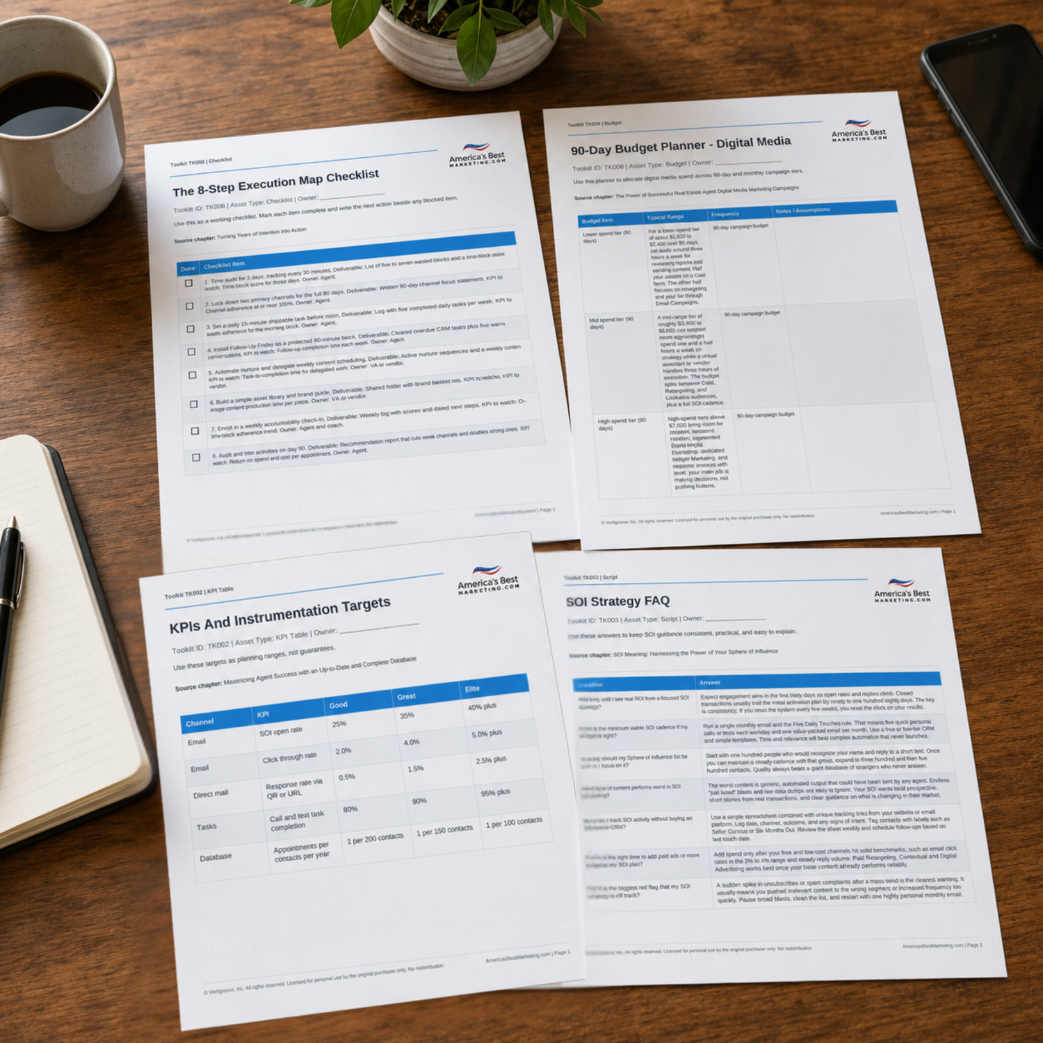
Download The Brand Kit Builder
Use the companion Toolkit to choose your palette, document your font pair, organize brand assets, define three reusable post styles, and deploy the same visual system across ads, email, print, social, and website graphics.
Download the Toolkit ZIPRecommended reads
Recommended Reads for Real Estate Agents
These articles help agents connect marketing strategy, content, visibility, and follow-up into a more consistent growth system.
Real Estate Agent Branding: Crafting Your Unique Identity to Stand Out and Attract Clients
Clarify the message, visuals, and client experience that make an agent feel distinctive.
Read article
What Makes a Real Estate Agent Memorable? Branding Psychology Explained
Turn personal brand work into a system clients can notice, remember, and trust.
Read article
Unforgettable Real Estate Agent Brand: Positioning, Messaging, and Consistent Touchpoints
Build a cleaner system for unforgettable brand, with better timing, clearer messaging, and a next step people can act on.
Read article
How to Handle Difficult Clients and De-escalate Situations
Use handle difficult clients and de-escalate situations to create a stronger bridge between client education and real conversations.
Read articleReal Estate Agent Brand Kit Questions
How long does a real estate agent brand kit take to build from scratch?
A focused solo agent can build a workable real estate agent brand kit in four to six hours spread across two sessions. Use the first block of time for color and font decisions and the second block for templates and documentation. The last step is a ninety day lock so you actually use what you built.
What is the minimum viable brand kit if my budget is tight?
Start with one primary color, one neutral, and one accent that all pass basic contrast checks, plus a single font pair. Add one market stats post style, one simple flyer layout, and a short brand sheet that explains how to use them. As budget grows, add channel specific templates instead of new colors or fonts.
How do I choose a primary color that does not look cheap or trendy?
Look at the palettes you already like on serious financial and professional sites. Coastal, Warm Modern, and Evergreen palettes all lean calm and steady when used with plenty of neutral space. Avoid neon accents and very bright gradients unless your market expects a loud style and your audience clearly responds to it.
What font mistakes make agents look unprofessional fast?
The fastest way to look sloppy is to mix many fonts with no clear rules. Avoid script fonts for body copy, avoid novelty fonts for headlines, and do not stretch or squeeze type. A clean pair such as Inter Tight with Source Serif Pro or Poppins with Roboto sends a far stronger signal than fancy styling.
How do I track brand results without advanced tools or a designer?
Use a basic sheet that logs posts, email sends, and mail drops in one place. Record the template used, minutes spent, and simple metrics such as clicks and replies. Over time you will see which layouts attract more responses and which channels carry your real estate agent brand kit the farthest.
When should I refresh my brand kit and what should never change?
Review your kit every six to twelve months, not every week. You can refine spacing, photography style, and small layout details as your skills grow. Try to keep the core color system and font pair stable so your market keeps recognizing you even as individual pieces evolve.
Does a brand kit still matter if I already have a logo?
A logo without rules for color, type, and layouts is just a sticker. The real estate agent brand kit tells everyone how to use that logo on social, mail, email, and your site without guesswork. That is what turns one graphic mark into a reliable signal of how you run your business.
Next step
Build the System Behind the Advice
Continue from one useful article into the larger ABM ecosystem: the book series for strategic depth and the full marketing program for done-for-you execution.

View the Book Series
Explore the America’s Best Real Estate Agent Marketing System books for a deeper strategic framework around visibility, referrals, listings, lead generation, and growth.
View the Book Series
See Full Marketing Program
See how AmericasBestMarketing.com runs real estate blog writing, social media, email, direct mail, retargeting, listing marketing, and strategy in one managed system.
See Full Marketing Program